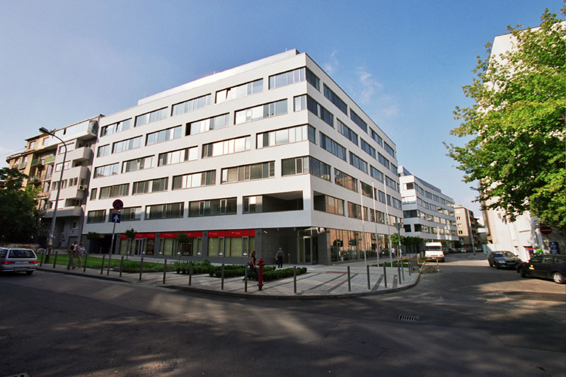
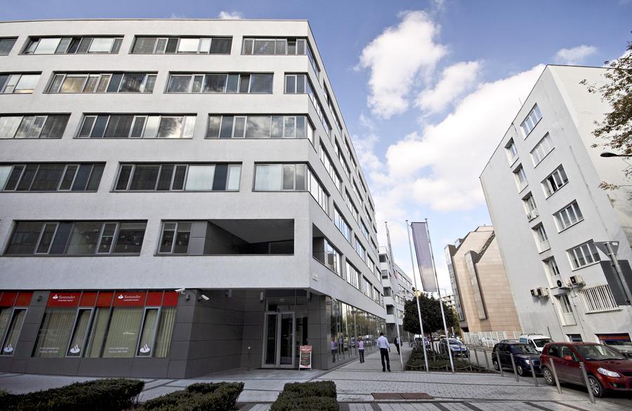
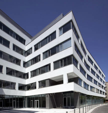
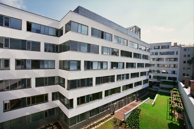
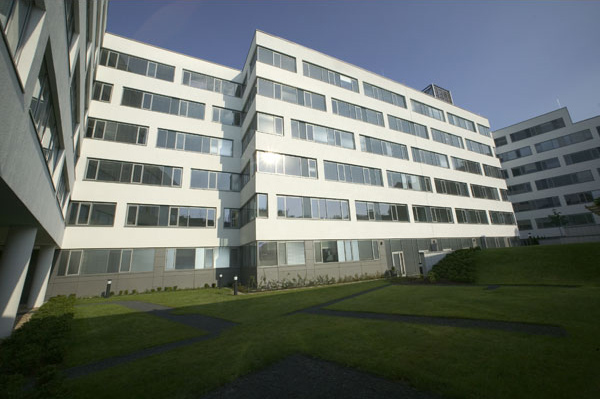
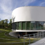
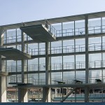
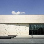
This area of Víziváros previously had an unified and intensiveli built architectural character. The density increased futher by the constructions after the war, but the balanceoverturned and more selfserving, mismatched buildings were created in the 70s. The architects of Építész Stúdió designed a building at the corner with a specifically calmfaçade which doesn’t generate additional conflicts with the old, neighbouring apartment house, with the opposite characterless office block or with the unclassifiable styled, pseudoelegant office palace which was built as an encroachment of the 80s.
- architects: Iván NAGY, Sándor PÁLFY - Építész Stúdió Ltd.
- year of design/construction: 2005
- fotó: © Tamás BUJNOVSZKY, © Attila POLGÁR
- → see the building on the map "hungarian architecture"!
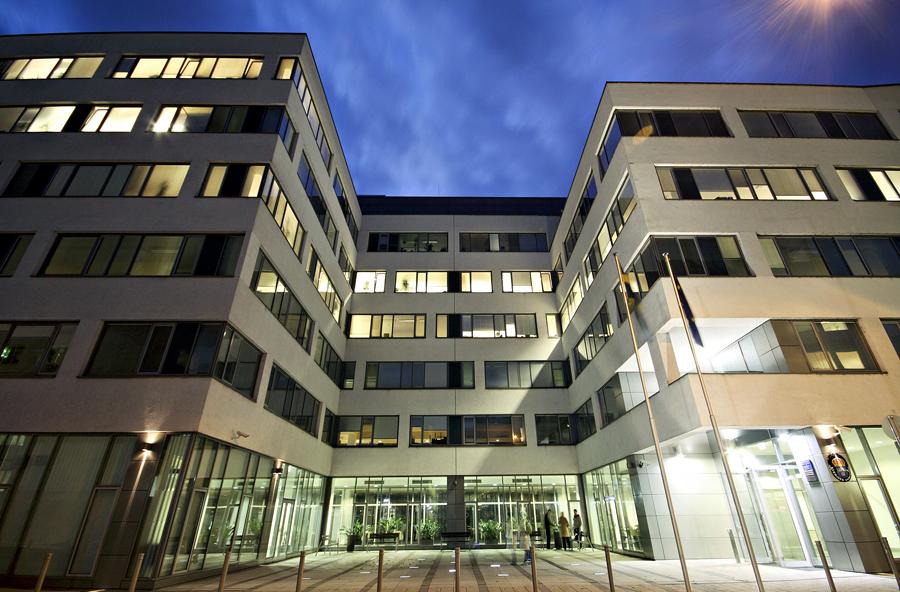
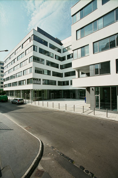
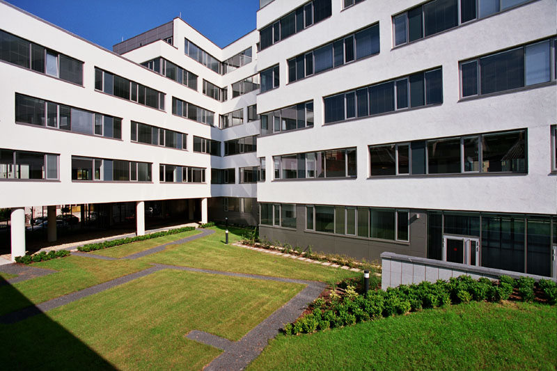
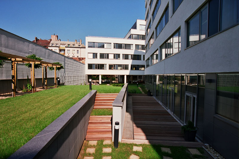
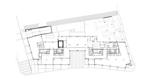
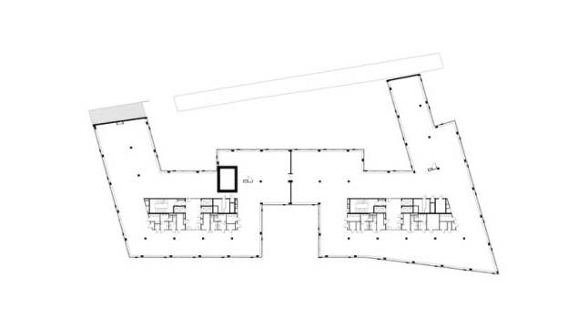
Strictly following the provisions of the local urban development-plan they designed a ribbonlike serpentine installation through the property for a number of reasons: the building size justifies separated masses and minimum two, approximately equal entrances are required, and the design must respond to the stenosis of Kapás Street and all must be solved within a framework of a single and generous architectural concept. The planned “meander” solves all these things at once.
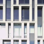
The site required a façade system which is powerful, consequent and able to handle the constrains due to its function and able to have an integrated, but not boringlyonedimensionalstyled solution for all the façades. The important point is that in the front of the tectonic system of the loadbearing structural system a crust appeares which runs as a curved, perforated “plate” in front of it. However, its punching differs from that and it is offset on every level in one way which unbalances and sets in motion the surface of the façades.
The two different planes of colour and material application, with the minimum use of material and colour, emphasises and enforces the layers of the façade. The resulting interference provides a playful, but disciplined character for the façade, which is able to handle the large surfaces.
They didn’t forget about the “fifth” façade either, because the top of the building can be seen from the Castle of Buda. The new office center isn’t progressive, it rather tries hard to hide the tensions, which can be found inside, underneath and behind itself so muchthat at first sight it might be seen rigid and conservative, but despite all the difficulties andproblems it surely works well in terms of function.
Translation: Anna ILLÉS
Publications on English:
Award:
Data:
- client: Kapás Center Ltd.
- scale: 27.900 m2
- the building on the homepage of the architect;


