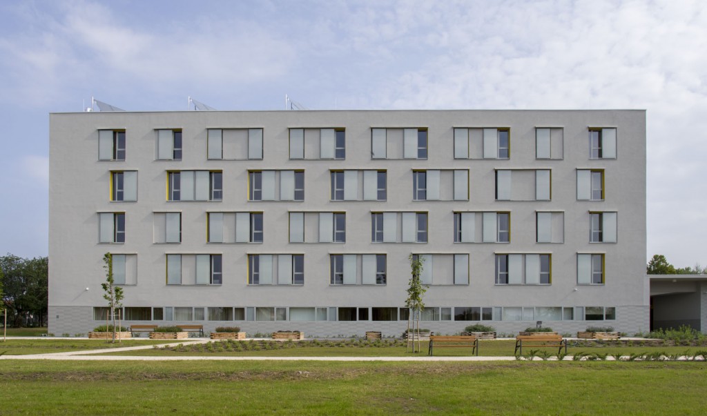
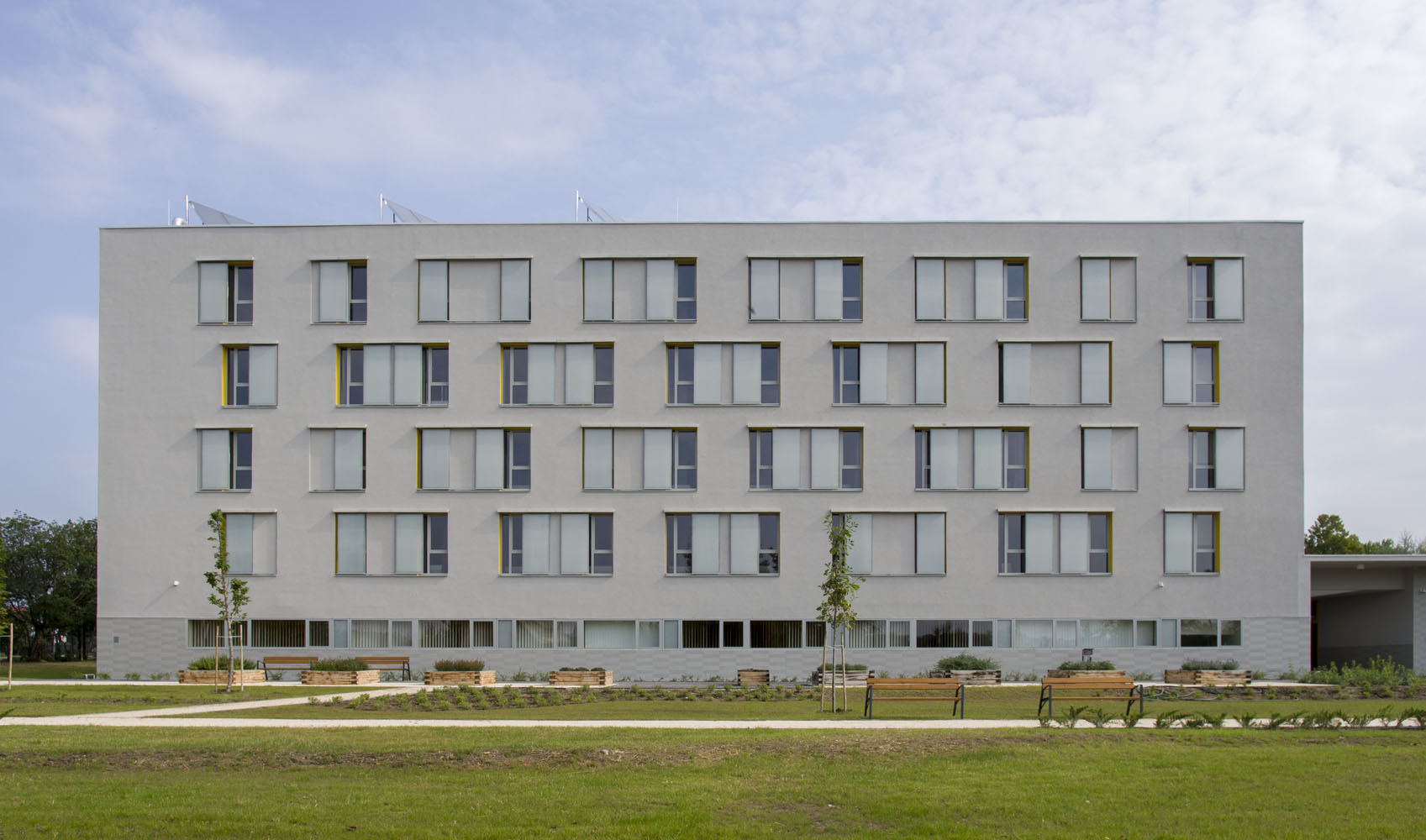
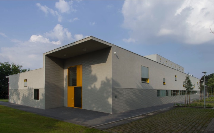
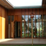
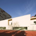
Designing the rehabilitation institute needed thorough research and preparation. The facility creates a space for those adults whose sight is damaged and is getting worse, to prepare and adjust them for the life after they lose their sight completely. This is the first building in Hungary which was designed for this specific function so the designers had to pay huge attention to choosing the right site, to create an ideal interior and exterior for the inhabitants and to using the right materials, while the couldn’t base their decisions on previous examples.
- leading architect: Balázs TATÁR, Balázs FALVAI, Márton NAGY, Dávid TÖRÖK - DMB Műterem
architectural consultant: Mihály BALÁZS
interior design: György FRANK - year of design/construction: 2013/2014
- photos: © DMB Műterem
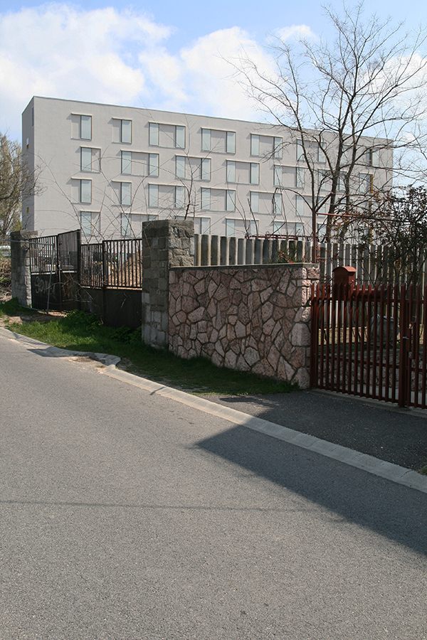
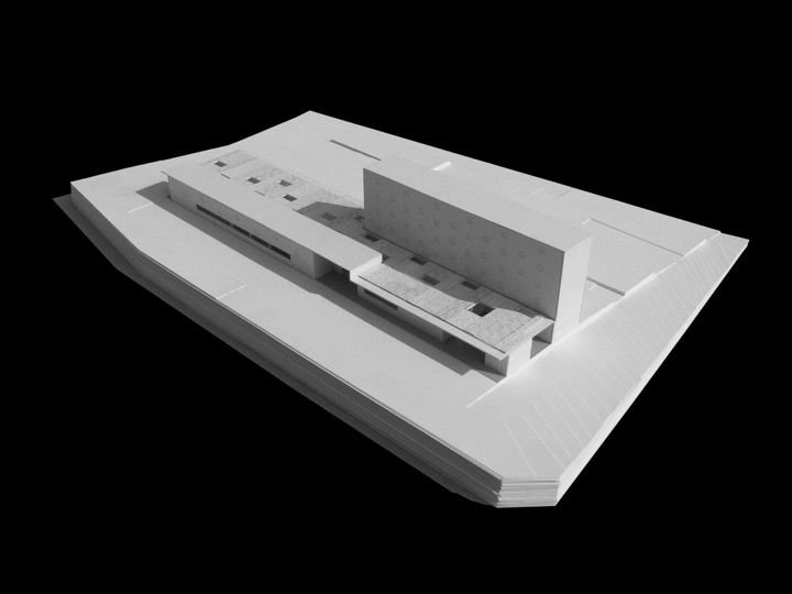
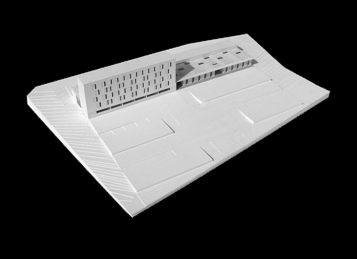
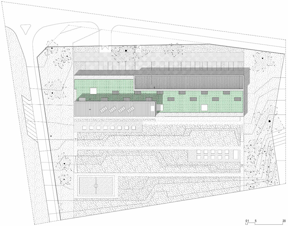
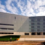
At the end they chose a lot with an old school building standing on it. It was ideal beacuse it was close to the train station, and wasn’t in the city centre, so it was easily accessible and also provided a good learning environment. Unfortunately nothing could be reused from the school building, because it had a very complicated stair system. The only resemblance between the new and the old building is the main volume. The rehabilitation institute consists of two parts, a vertical building containing the rooms of the inmates, which is in contrast with a horizontal part with the course rooms and a conference hall. The 36 rooms can give accomodation to up to 45 people, who take part in the programs in groups with 2-3 members. The programs are held inside, as well as outside in the institute’s garden and the surrounding neighbourhood. Since this kind of rehabilitation institute is unique in Hungary, the building became a regional center as well for VÁI, where they hold events and conferences about the facility and about how it works.
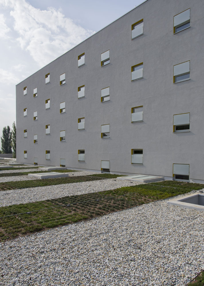
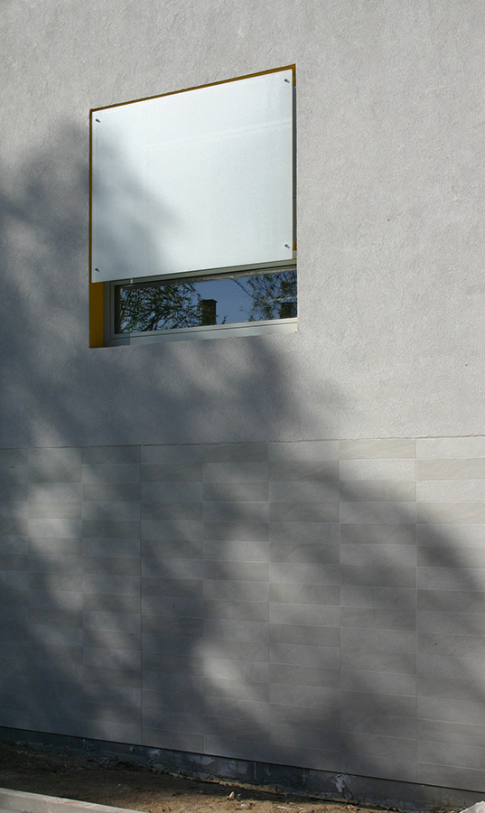
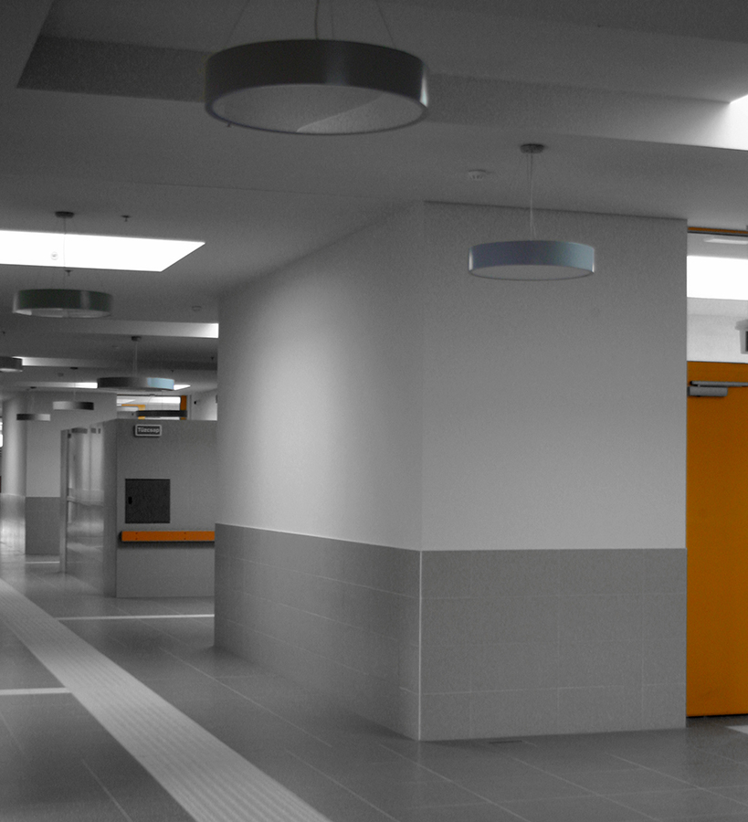
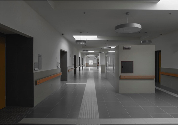
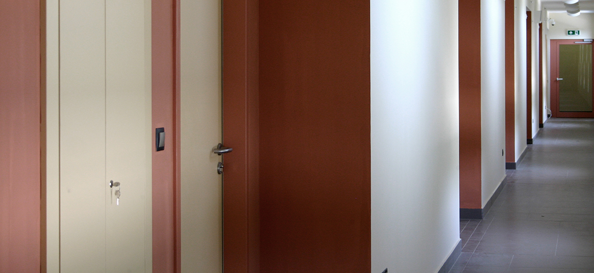
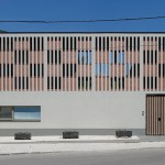
During the desing process the most important task was to make orientation as easy as possible for the people with damaged sight. Contrast in regards of light is specificly bad for their coordination so all the windows were covered with a glass covered with ceamic paint which filters the direct sunlight while letting in 80% of it. On the other hand contrast in space size, colour, and the feel of the surface help to give directions to them, so thats how the designers highlighted the doors in the bulding.
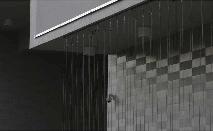
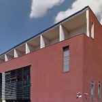
The buliding’s monochrome colour which even appear on the windows show a symbolic relation in appearence to the function. This however is an architectural gesture which is mostly based on the very realistic requirements of the rehabilitation institution.
source: interview with the architects
text/translation: Luca Lidia GALLYAS
Data:
- client: VÁI (Vakok Állami Intézete - National Institute of Blind People)
- area: 2605 m2

