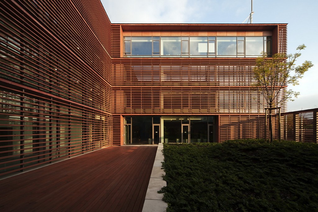
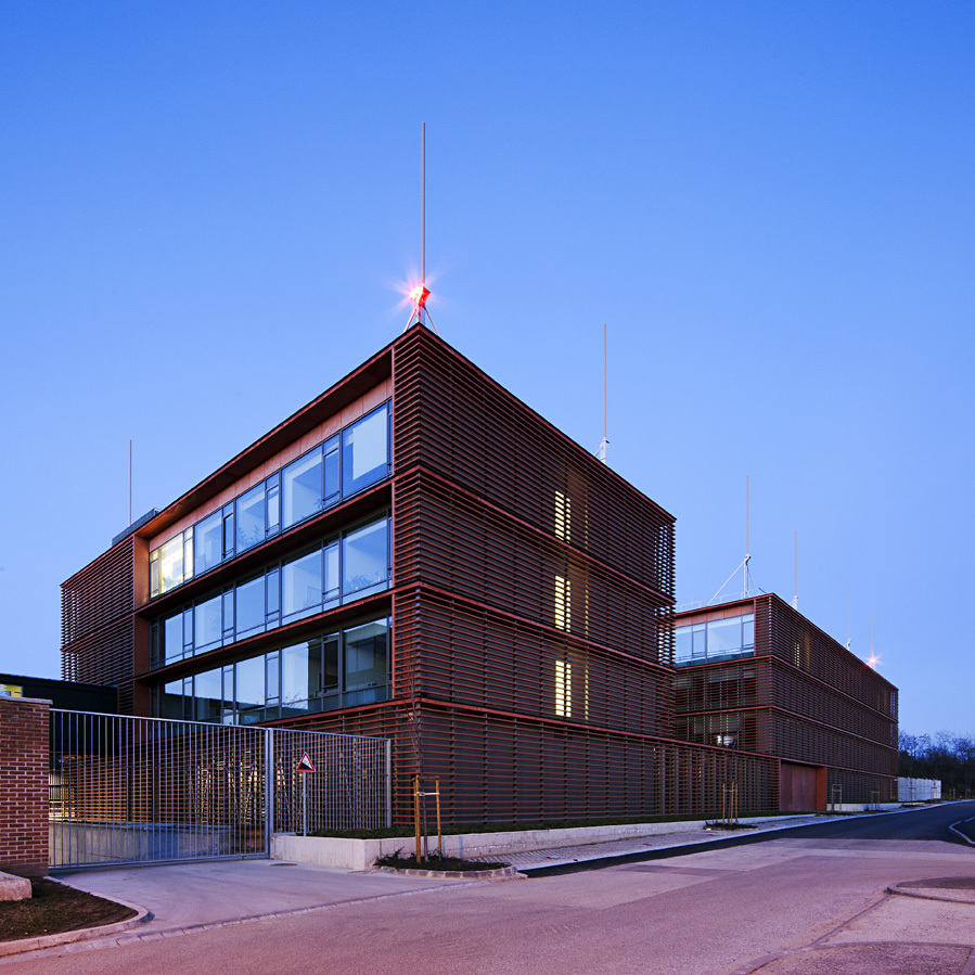
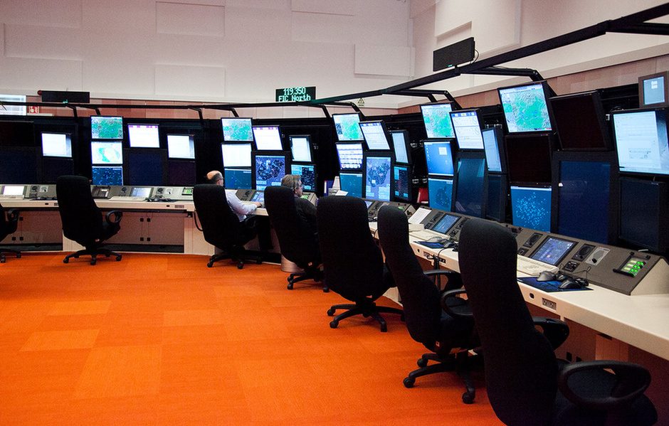
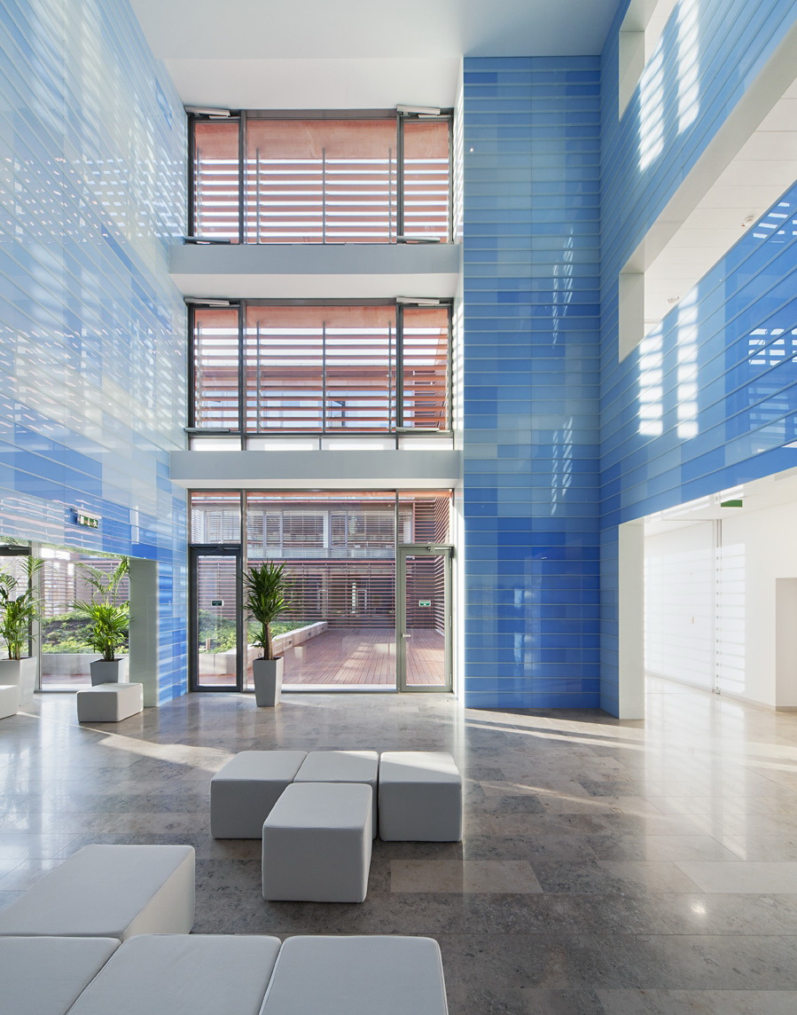
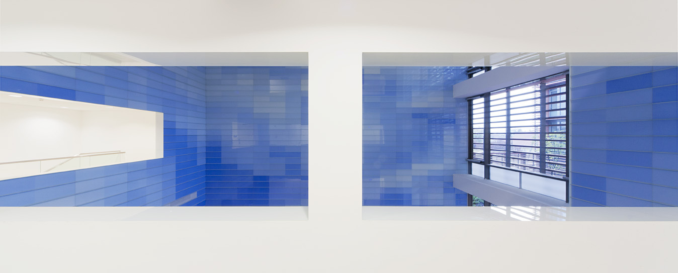
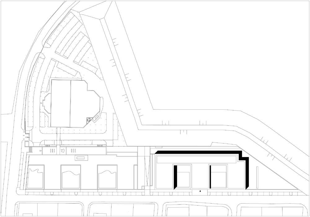
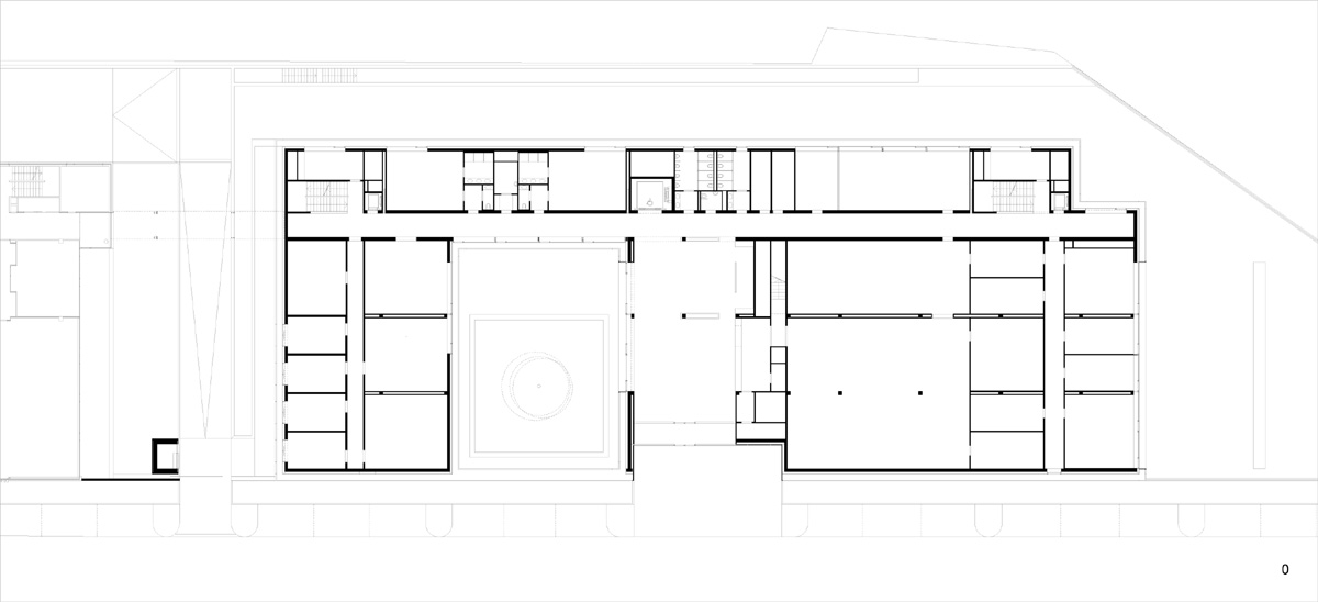
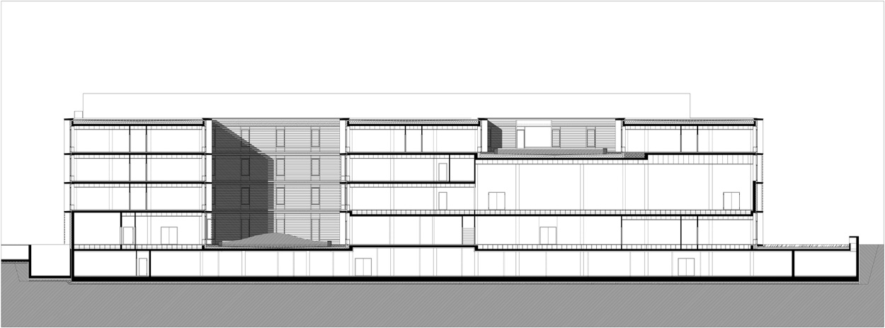
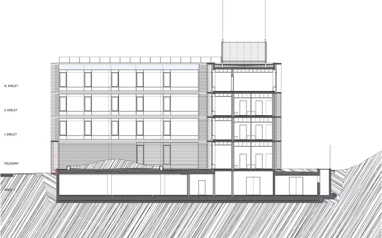
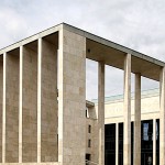
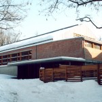
The stake of the design competition organized in 2007 for the extension of the building complex of ANS II was primarily the matter of defining the relationship with the building of Tamás Nagy. The design of Zsolt Zsuffa and László Kalmár continued the scenario of Tamás Nagy in a way that made them able to fit this significantly different spatial program into the system determined by the previous building to be extended.
- architects: László KALMÁR, Zsolt ZSUFFA - Zsk Architects; leading collaborating architect: Gábor NAGY collaborating architects: Glória Papp, Szilvia Rehus (competition), Katalin Fazekas, Zsófia Lázár, Mihály Kanyó (permit and tender plans),Gábor Nagy, Iván Patrik Kund, Balázs Rose (execution plan) interior design: Gábor Szokolyai, Dénes Kovács
- year of design/construction: 2008-2010/2011-2012
- photography: © Tamás BUJNOVSZKY
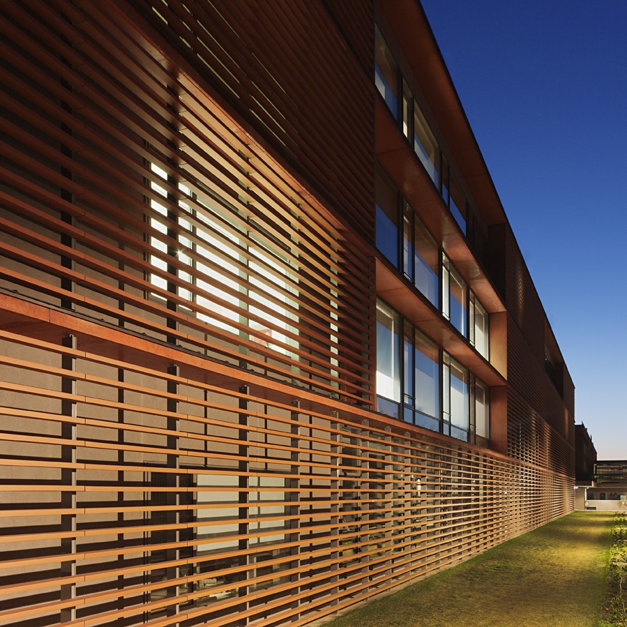
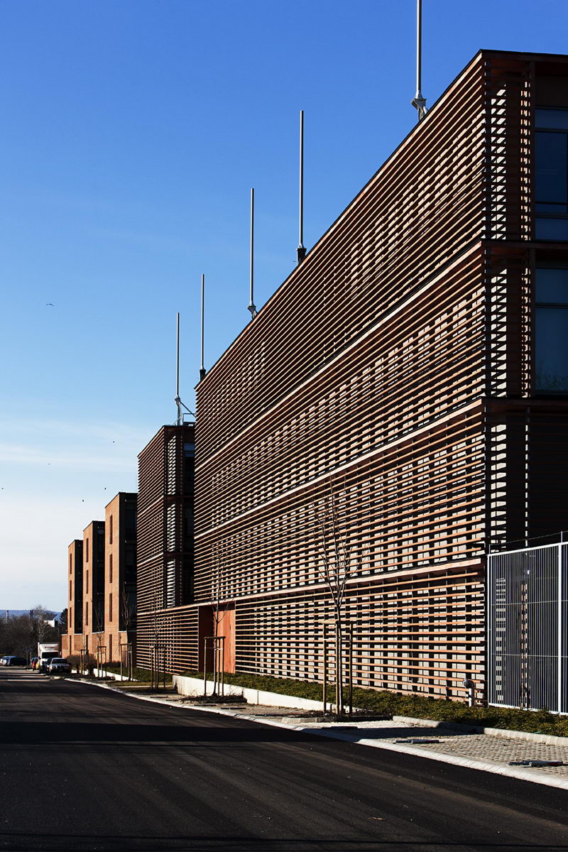
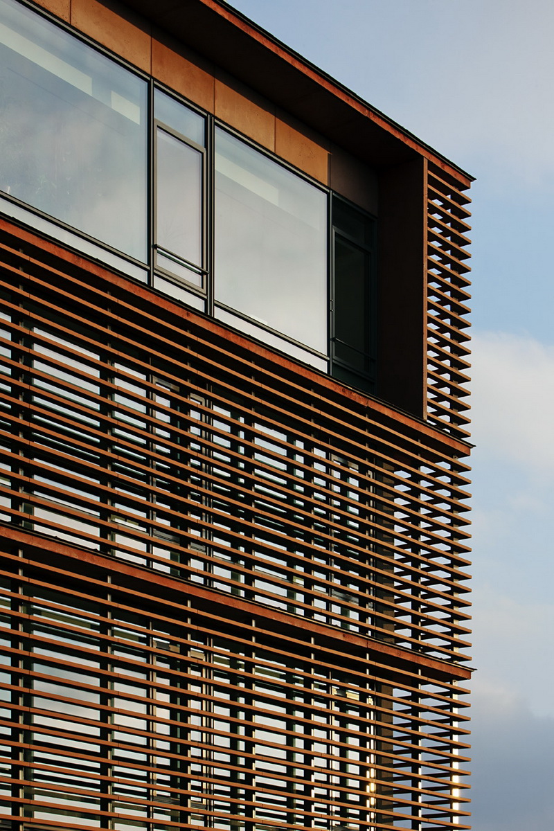
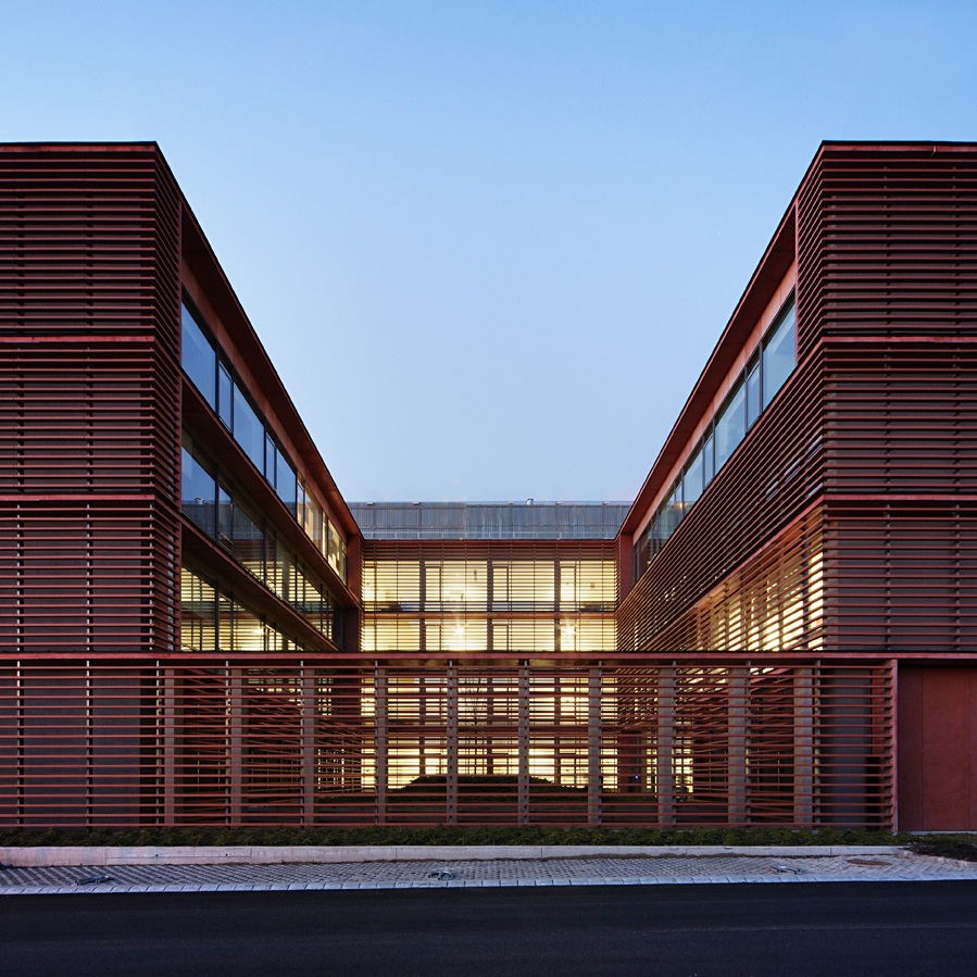
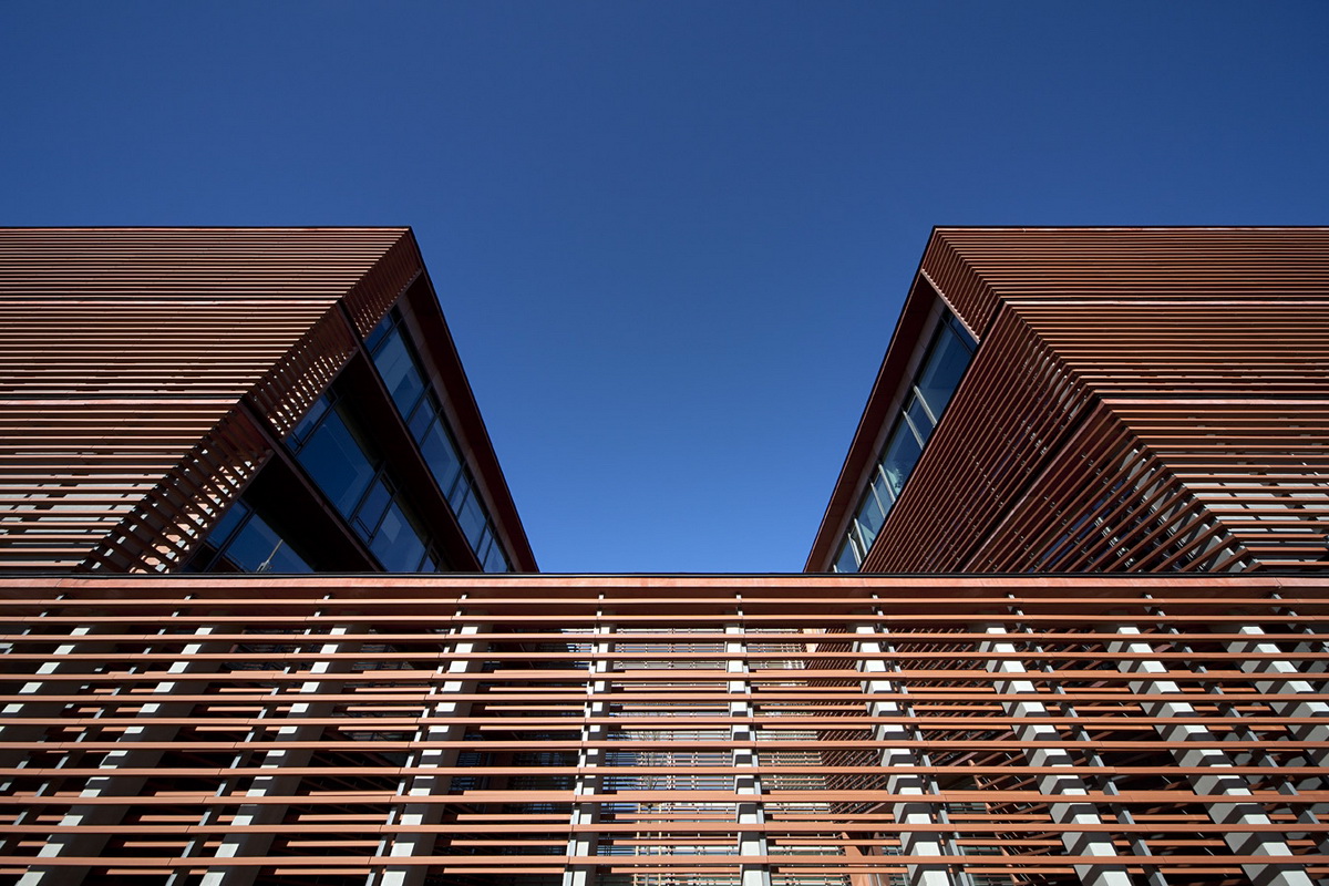
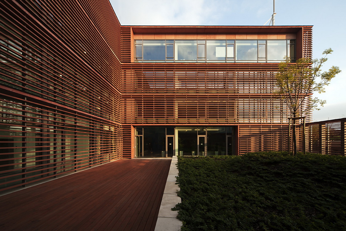
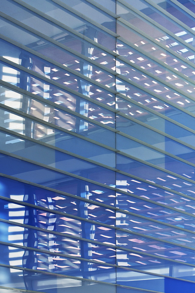
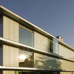
“The surroundings do not require any new architectural character, preferably the existing one needs to be reinforced.” – drew up the architects in the technical description of the competition plan. Instead of brick facade cladding,the architects applied a ceramic lamella system installed on a separated load bearing structure as a secondary skin.
This solution – according to their plans – took over the main characteristic of Tamás Nagy’s building, namely the architectural use of burnt clay and at the same time radically reinterpreted it: the familiar connotations of brick, its massiveness, sensuality and the handcraft was replaced by the lightness, sterility and industrial style of lamellas. This solution is a true curiosity. The custom-made lamella system was developed by the architects and the manufacturer, generating the longest ceramic lamellas used until now (180 cm).
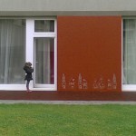
The lamella skin of the new building is well differentiated too: it seems massive nearlylike a wall structure but behaves like a transparent, translucent membrane at the same time.Placing the rustic surfaced small brick and the perfect, precise ceramic lamellas next to each other results in a productive stress as we can see radically different usages of the same material. The result differs from the competition concept slightly, changes were made according to the clients. Instead of a new main entrance, you can approach the building trough the older ones, after control. The architects solve the situation by installing a huge, colorful concrete wall, but if it’s needed, it can be easily reopened in the future.
"Here, architecture can be practiced at a high standard only in this way.” – says the assessment of the jury.
English version based on archdaily.com, collected by Borbála PAPP
Publications:
internet:
- "Tartalék ATS központ (ANS-III épület)" - result of the competition (in Hungarian) in: Építészfórum, 2008. január 10.
- Levente Szabó: Center of Air Navigation Services / ZSK Architects, in: ArchDaily, 2013.03.29. - the same text on Archello, may 2015;
printed:
- ZsK Architects: Air-line Traffic Control Centre Competition - in: Magyar Építőművészet, 2008. /1., p. 42-43.
- Dominika Vámos: One, two, three - Air Traffic Control Centre of HungaroControl - in: régi-új Magyar Építőművészet, 2013/3, - see the shortened online version here!
Awards:

