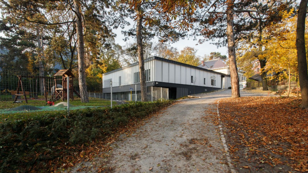
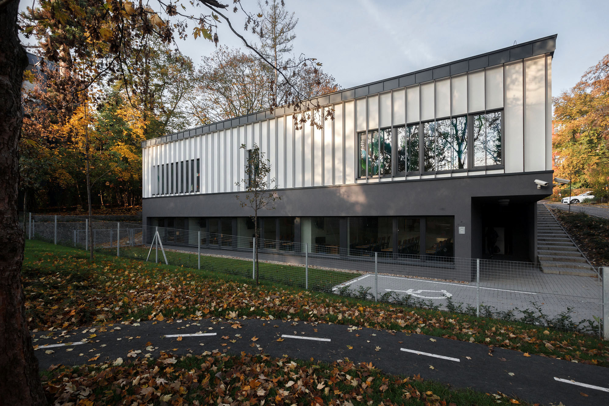
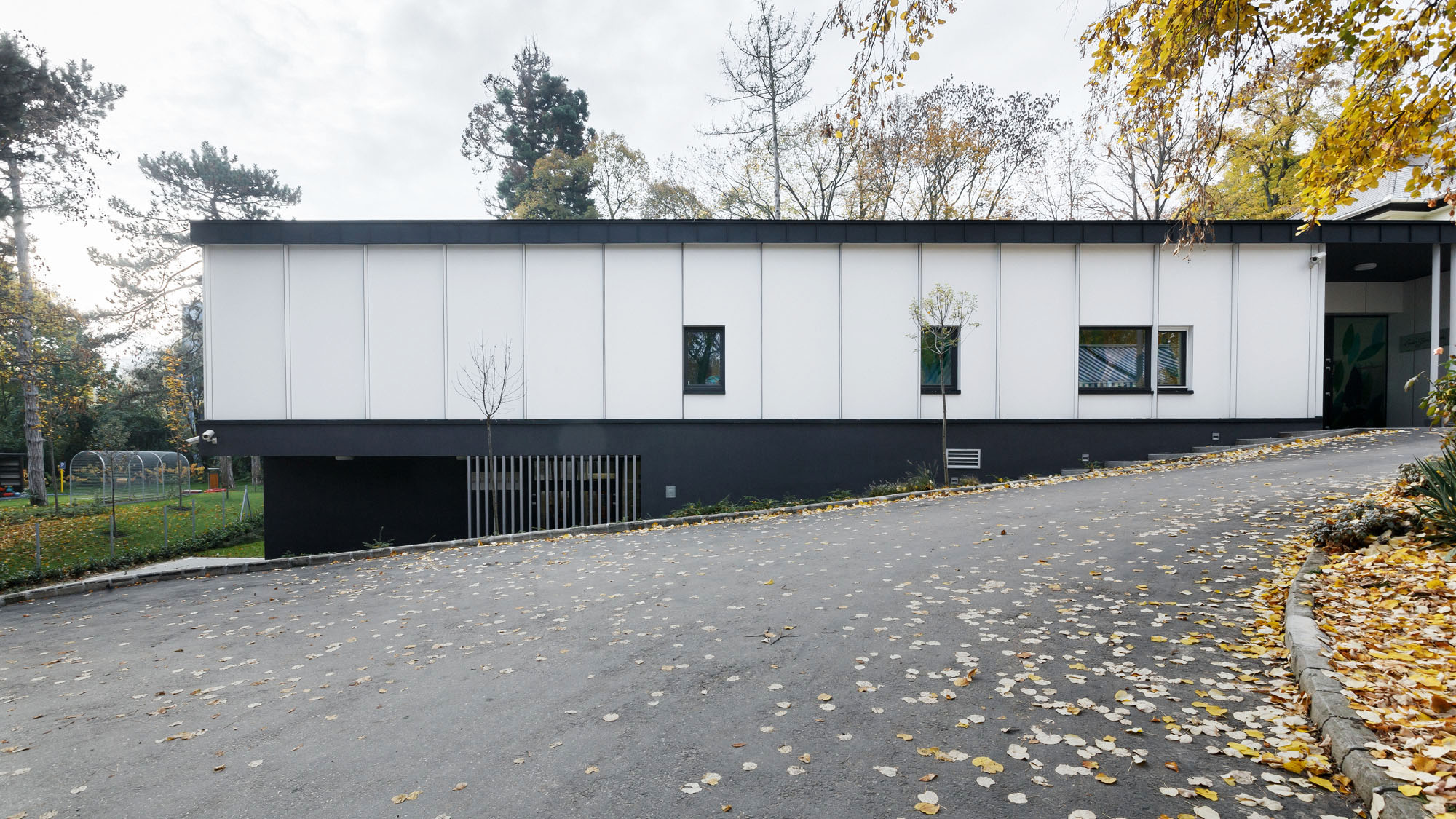
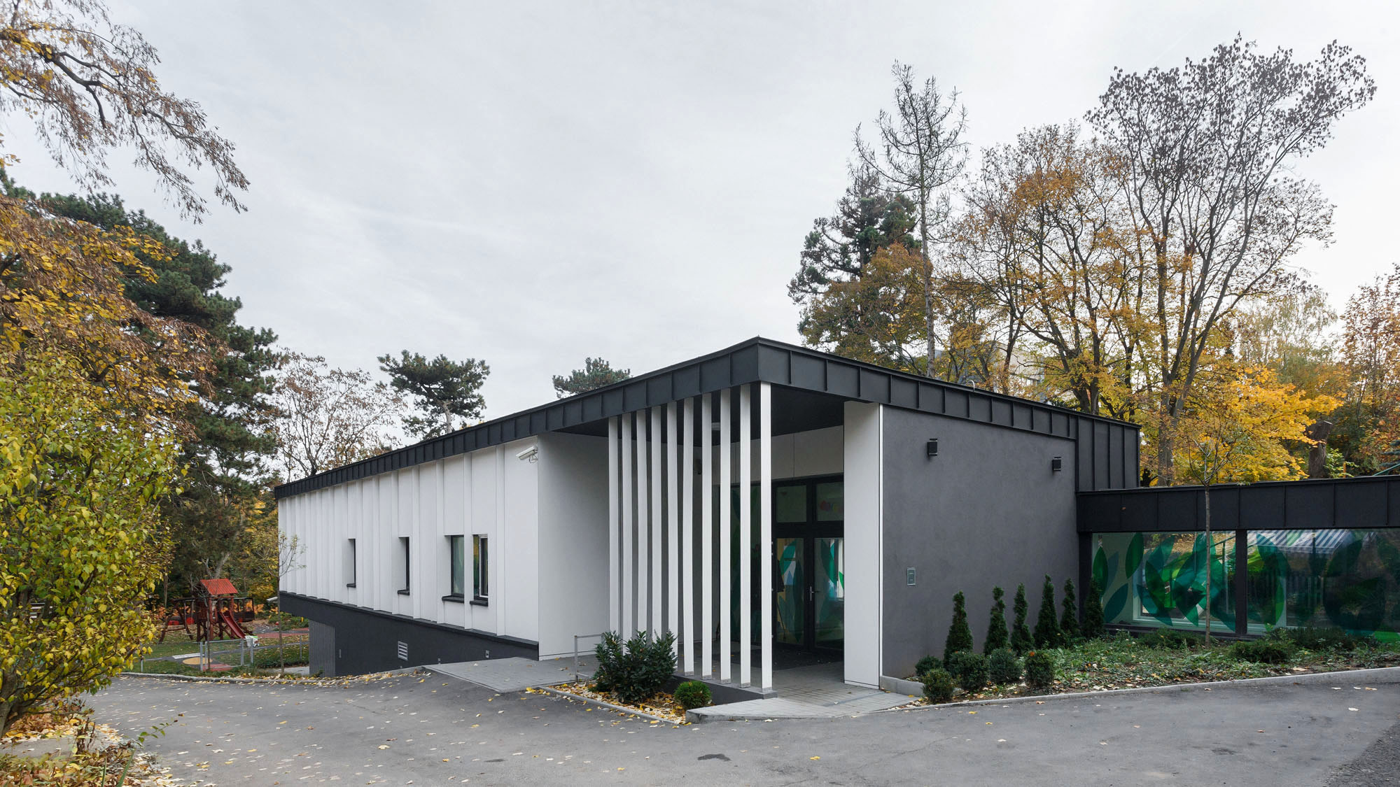
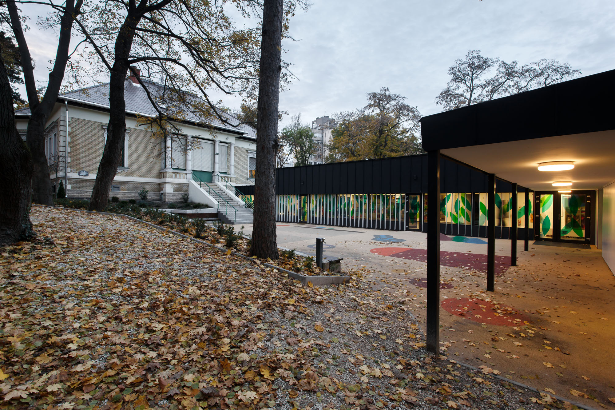
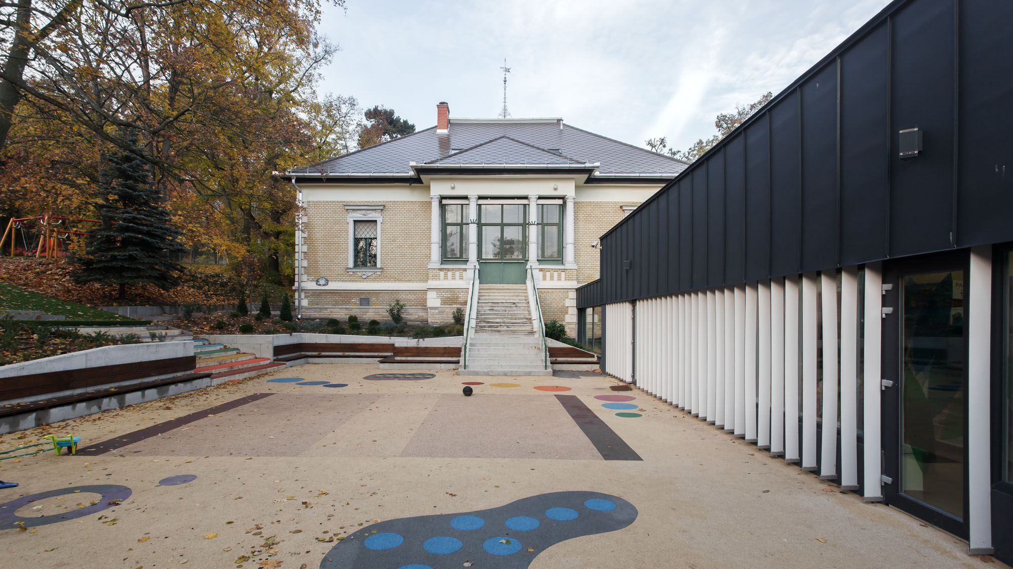
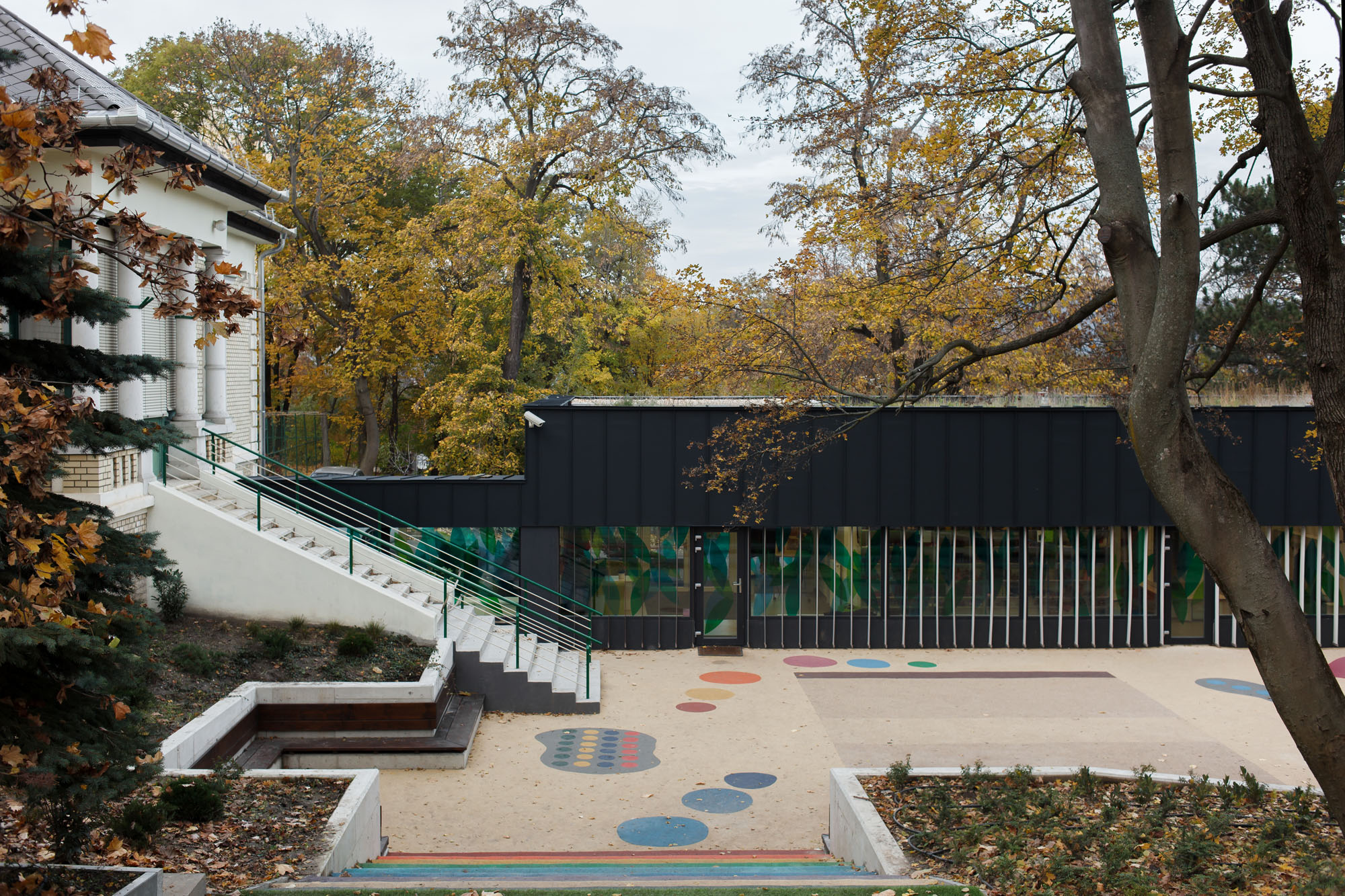
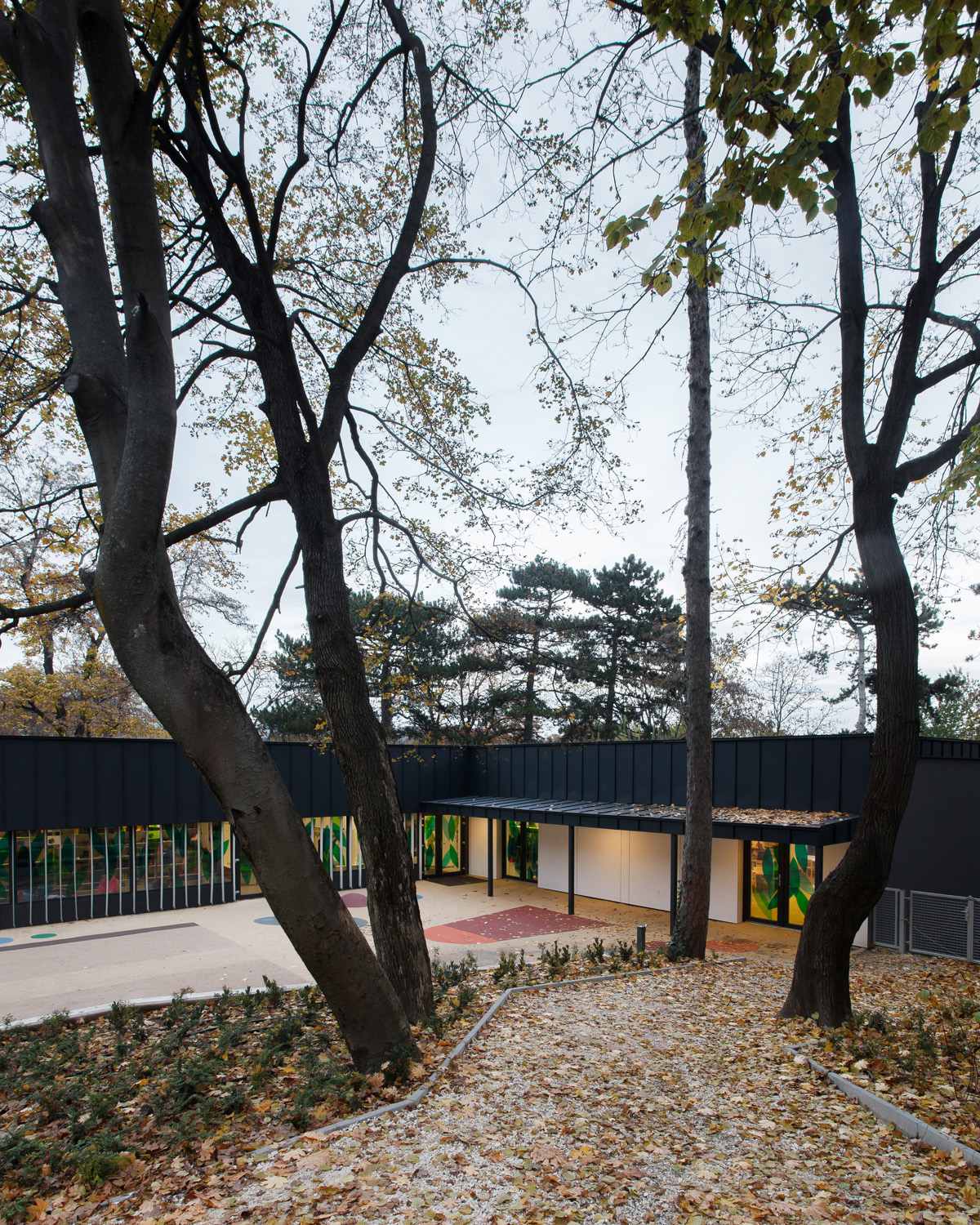
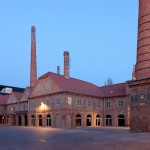
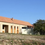
The new extension of Lauder Javne Kingergarten removed the load of the eclectic mansion, that struggles with the lack of space, providing pleasant new places for the preschoolers’ development. The plan of Szokolyai Gábor and his team blends into the terrain and the already existing building like an elegant block.
- leading archtect: Gábor SZOKOLYAI - MCXVI Építészműterem Kft.
- építész munkatársak: Ágota DEMETER, László HERCZEG, Tamás PINTÉR;
- kert- és tájépítész munkatárs: Karolin BÁN;
- üveggrafika: Katalin IMRE;
- year od design/construction: 2012-13/2014
- photo: © Balázs DANYI
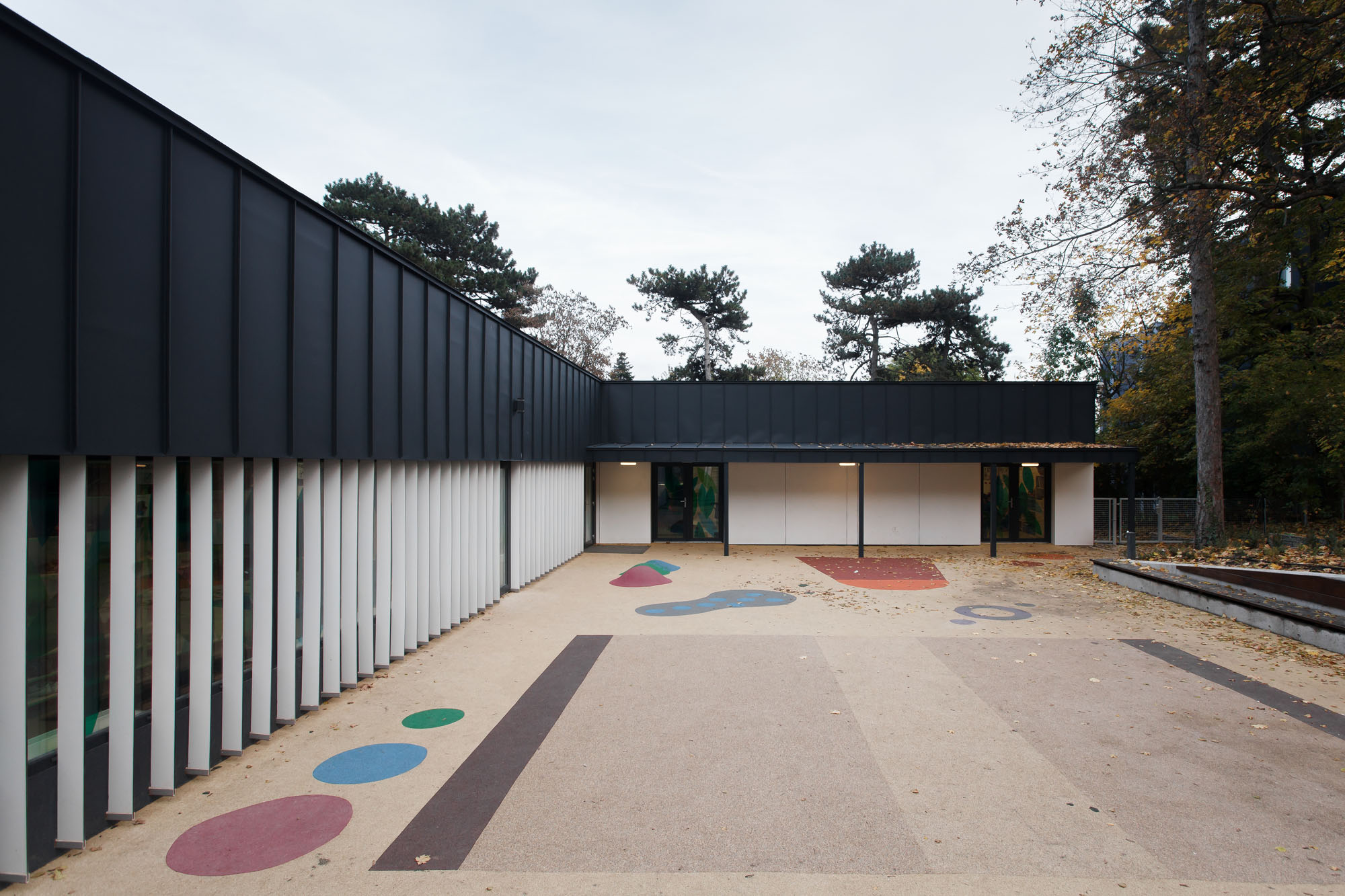
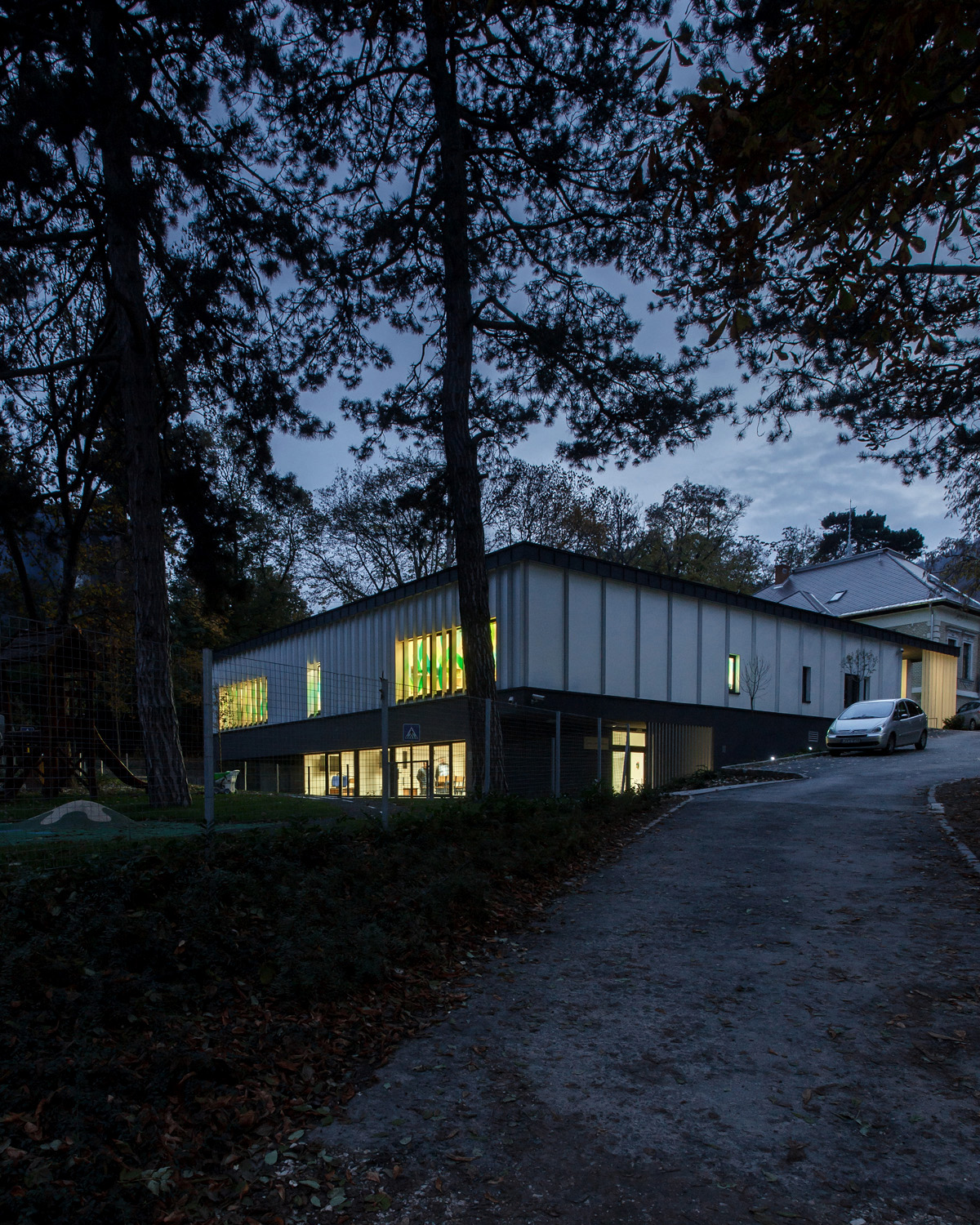
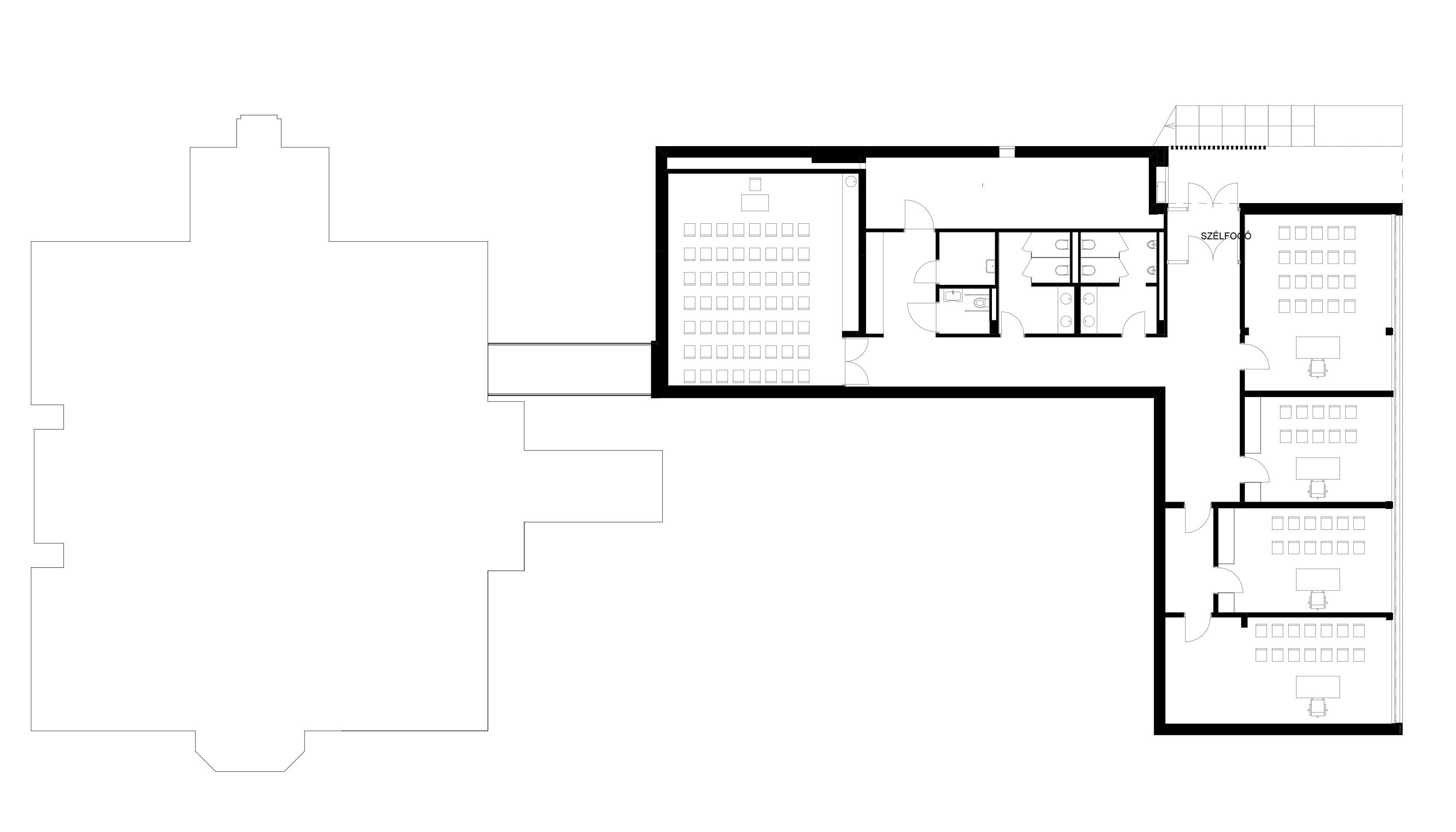
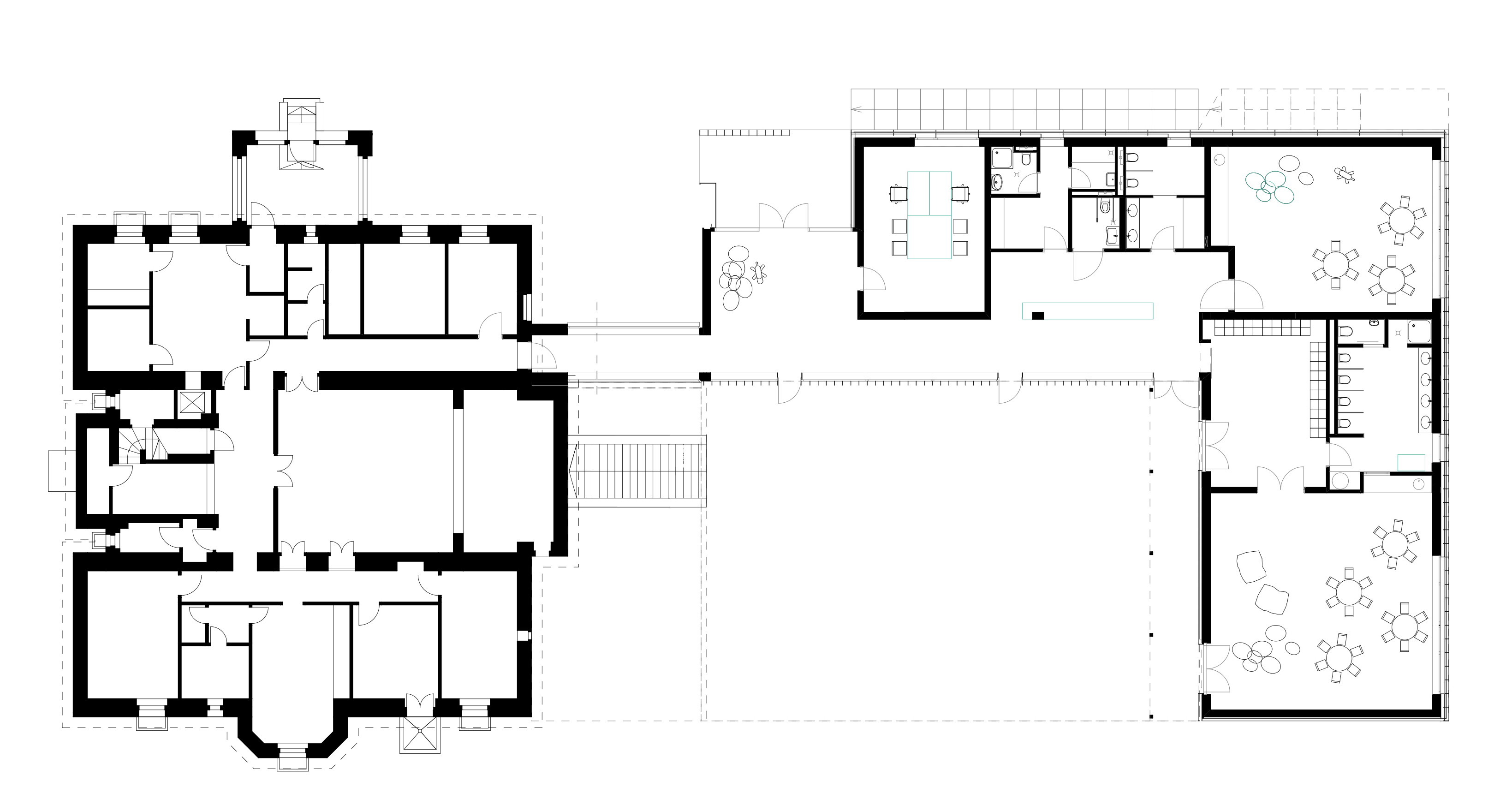
The new entrance of the institution was costructed at the L-shaped new annexe’s end that faces the old building, abolishing the entry through the maids’ entrance, which is unworthy for a historical edifice. Entering the building we arrive in a hall where we get an insight to an inner playground. Through the corridor, that is attached to the hall, and the connecting section of the two buildings, we get into old premises. The building is a retaining and a bounding wall at the same time. Landscape architect Bán Karolin designed a patio that maintans the level of the old edifice and is ensphered by group rooms and service rooms. Thus the children were given a more closed, more intimate playground. Making the best of the terrain’s characteristics, the storey below has a separate entrance. The offices and the classrooms were placed here.
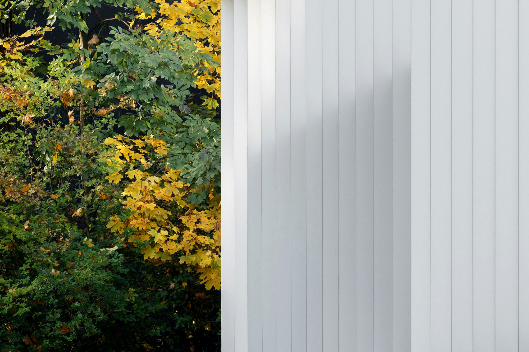
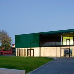
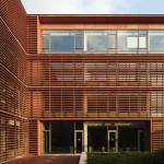
The low plinth level has dark grey cladding and huge windows facing the playground, so the lower rooms receive plenty of light. As an inverse, the upper storey overtowers the dark zone with its white cladding. The compact sheet lamellae provide shielding, yet, from the building’s perspective, they give an insight or even mysteriously hide the windows of the kindergarten’s group rooms. The external gestures appear the other way round on the patio’s elevation. The glass surfaces of the hallway, which connects the patio with the interior, also have white lamellae, and where the corridor alters to a transitional space, the walls got white cladding, as well. The black metal casing starts at the parapet of the green roof, and runs down to that white zone.
The glass surfaces’ glass artwork breaks the strict-looking black-and-white body of the new annexe. The olive leaf pattern, designed by Imre Katalin, fetches a little playfulness to the pure architectural features.
text / translation: János KIEFER
Data:
- client: Secular Jewish School Foundation;
- scale: 768 m2

